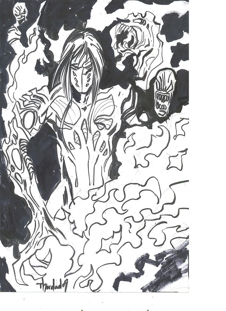
If this is your first visit, be sure to
check out the FAQ by clicking the
link above. You may have to register
before you can post: click the register link above to proceed. To start viewing messages,
select the forum that you want to visit from the selection below.
OOUUCHHH !!!! Thor Dead cross of the e ? HA HA HA Awesomeness !!!!
second comment on it but , crap thats my favorite thing Ive seen on this forum to date
No great man ever complains of want of opportunities. ~ Ralph Waldo Emerson~
OOUUCHHH !!!! Thor Dead cross of the e ? HA HA HA Awesomeness !!!!
second comment on it but , crap thats my favorite thing Ive seen on this forum to date
Sorry, mate. Didn't catch your reply in the challenges and discussion
section. It's all in good spirit . I wanted to add references that
it was a streetfight and I had to add your PJ name. Maybe it is
lack of sleep that gave me that idea. Gotta hand it to you, you
seem to know heaps of comic book/manga material. That's pretty insane.
Truth be told I bought The Darkness solely for Silvestri's art and don't
remember much of it. So long ago.
Thats what pummel is all about sf or monthly man , Ive seen your work before and have been impressed just didnt know you could bring that in an hour ....... next time I will know better
Thank you for taking the challenge these things keep me on course
No great man ever complains of want of opportunities. ~ Ralph Waldo Emerson~
This was a wierd one for me. Even though Dri has the better drawing, it doesn't appeal to me because it's on this very muddy paper...is that an effect you applied afterwards?
Thordad's just really fresh and appeals more to me. I think if you (Dri)would'v used a heavier pencil or tweaked the levels it would'v looked better.
I was in the process of adding highlights but didn't want to
go over the hour mark as a courtesy.
I think this was a really good try for an hour, but I still think you can do better.
I'm voting for Dri for the values and such in his piece. And Thordead haha. That's just funny. Having the highlights might have gotten you more votes, by the way.
I think I just have bad taste, but I think your (Dri) image looked much better on white paper. Unless you would'v made it look like the pencil lines were carved ito the wood, that would'v been cool.
^You don't have bad tastes Slam. Some people love the sketchy stuff
on white paper. I just like experimenting with methods in PS and often
get carried away. It burnt me in a draw off prior to this when i used
the same method.
Oh of course I'm all for experimenting, it's always brave to do it ona pummel I remember those series of drawing you did with the heavy rain, I was really fond of those experiments. I should have a look again at your sketchbook
Alfred , Thanks for the tip man and your right the darks look much better that way . And Thanks for the vote of confidence that I can achieve better ( I truly believe that as well )
I like the hour challenges despite my record in doing them , it forces me to focus ( I just need to focus a little harder )
No great man ever complains of want of opportunities. ~ Ralph Waldo Emerson~
Comment